 Popcorn Boxes UK is a subsidiary of Scyphus Paper Cups, a branded paper products manufacturer from Northamptonshire, UK.
We have more than a decades experience in manufacturing sustainable paper products like cups, boxes, sleeves and other paper marchendising products for the hospitality, automotive, agencies and trade show organisers. We provide our customers with a bespoke solution for all their disposable paper products like popcorn boxes, turning the mundane box into a moving modern promotional platform for their brand and business.

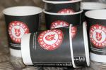
Printing art can overwhelm some people, but for a company that needs it for their coffee cups, it is important to master the process. Even those who do it frequently become nervous when they are running out of time.
There are a lot of details, checklists, and moving parts to take note of when it comes to preparing the project for commercial printing. It is important to know what the important do’s and don’ts are so that you will have the best practices when it comes to preparing printable artwork.
Most of the RGB is unachievable using the typical process printing of four colors. That is why it is advisable that you create a document from the beginning in CMYK color mode so you can check how the colors are going to look after they are printed out.
Tradeshow signs or large formats are both an exception, but it is more accurate to see it with the printer.

For sure you have heard of Pixels, and it is not surprising if you know some things about them. They are called pixels because the term comes from “picture element.” Pixels are the tiniest grid unit that depicts an image, and their shape could either be round or square.
Think of them like picture atoms, and they are measured by how many pixels are there in an inch. If there are more pixels per inch, the image will be sharper. When there are fewer pixels in every inch, you will see more pixilation where you see pixel edges.
You should remember that the required ppi for digital images is 72, which is a lot different than printing. That is the reason why whenever those internet pictures you print out and hang on the wall are small or blurry when you enlarge them. You should use an application that will ask you what size you want when you start working on a project so that you can say the size in inches or pixels.
Majority of print files are at least 150 ppi to make sure that you are getting the best quality. However, there are some products that need 300 ppi.
If they are for press ready design files, the images should be sent in high quality image format. The way images are compressed depends on the image format. TIFF and PNG are the most ideal for print projects. JPG will do if the quality is 100%, but it gets recompressed once you save it. The quality can quickly drop if you save it at less than its maximum quality.


You should not put a background unless it is part of the design, and this is very important for commercial printing. For instance, if your black background is printed on a black item, it will come out as a greyish rectangle around the design.
The reason behind this is that when black is printed, it needs a white underbase, so the printed black shade will be lighter.
DPI or dots per inch is similar to ppi, but it says how many dots there are per inch. The number pertains to the printer resolution and it has no direct relation to the image being printed. If there is a higher dpi, the image quality is better and smoother. The printer will normally say what resolution it needs to produce quality print outs, but the standard is 300 dpi.
The way ppi, dpi, and resolution impacts printing depends on the kind of printer you are using. It is important to have a good relationship with your print partner because it will reflect your art’s original intention.


Embossed text, graphics, and artwork give a 3D effect because they are pressed upward. Debossing is the total opposite because the design is pushed down to create an indentation. These effects can either have single or multiple levels, or sculpted. This is also possible for coffee cups, and when you hire an artist for this, they use clay to sculpt the work to create a mold for the project design. Embossing or debossing is more costly to produce, but the level of detail is incredible.
Each product’s texture and feel are different after it is printed. That is the reason why when picking out design for your product, consider how the print out will look like. Your design should look good on the product. For instance, patterns come out nice as all-over prints, photographs function properly as posters, and DTG products work well with typography designs.
If someone is selling clothes, designs are going to look a bit different based on fabrics and their blends they are printed on. The ink on sweatshirts look more spread out and faded because it is a thicker fabric.


Bitmap images are the same as raster, and pixels form them. They are gif, jpeg, or tiff. Another example of raster image are photographs because they are all made of pixels. You must be careful if the file is in high resolution because they are higher to maintain. When you are printing them, you must be extra careful too, but they are important for photographs and standard for anything.
Vector images use math because there are several kinds of it behind every vector scene such as shapes, points, and strokes. Every vector is comprised of invisible grid points and they are all connected using math equations. That means size is used to scale a vector, and the math behind it keeps everything sharp and proportioned. That is why vectors are mostly used for clipart, logos, type, font, and more. They are more flexible compared to pixelated images, making them ideal for large project printouts.
These are the information you need to keep in mind when preparing printable artwork, especially if you need it for your business or commercial use.


.jpg.jpg)